
LivingPath
How MIGHT We HELP PEOPLE discover senior living communities?

Overview
Timeframe: 3 week-long sprints
Tools: Axure, Keynote
Role: User experience (UX) research, information architecture, product design, interaction design
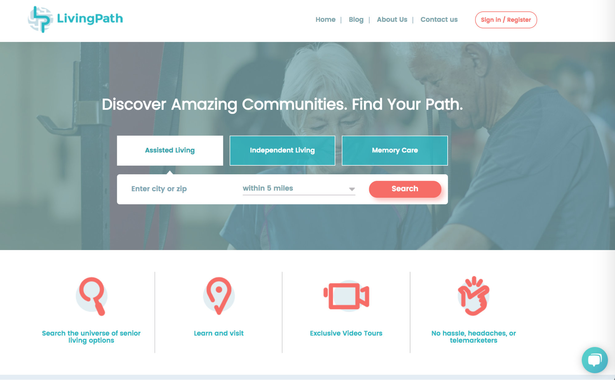
LivingPath is an online research tool and search engine for senior living accommodations. The site launched in 2016, and has been lauded for being comprehensive and transparent in an industry that has historically been fragmented and slow to adapt to technology. My team of 3 designers conducted their first usability tests and proposed changes to their website to make it easier for users to narrow their search and compare communities.
01. The Challenge
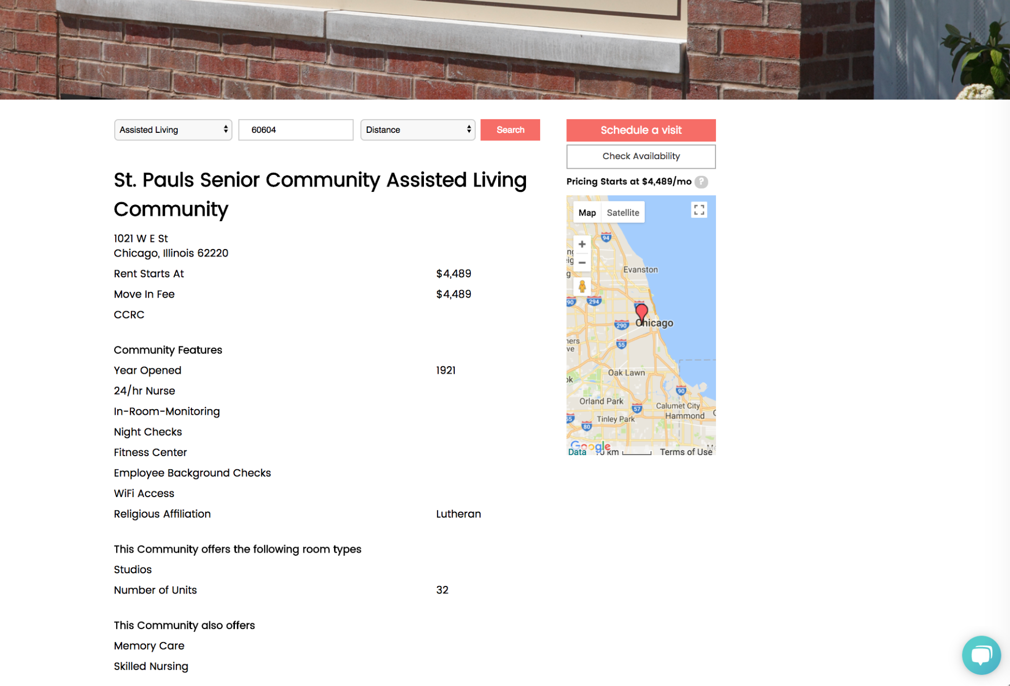
LivingPath founders Isabelle and Jonathan saw how frustrating it was for families to research senior living options so they created a platform that makes it easier for people to navigate the maze of senior living on their own terms. The site aggregates and displays information about senior living communities, including information on price and availability, and allows people to search for communities by the level of care (Independent Living, Assisted Living, and Memory Care) and location. While most communities opt for free, simple listings, some pay for premier listings so they can include a greater quantity and variety of content on their page. Once on a community’s detail page, users can fill out one of three lead forms: schedule a tour, ask a question, and check availability.
Our client hadn’t done formal user research or testing before my team of designers came on, but they had received feedback, from both users of the site and communities, which informed the scope of our project. During our kickoff meeting, we asked our clients to write out their goals:
“We want to solve usability/ease of engagement in order to connect our users with amazing communities in real time.” — Jonathan, co-founder
We were asked to:
Find out how we can lower the barrier of entry for users.
Learn how we can focus on building credibility.
Figure out how we can make premier listings stand out on both the search results pages and community detail pages without making the basic listings look bad.
Our client suspected they ought to create a faceted search that allows users to narrow results by a few more features and add options to save, like, and compare communities of interest, but they were willing to let research validate and guide any changes.
02. Our Approach
In an effort to understand users’ journeys of searching for senior living, we spoke to six people who were looking for senior care or had looked before. We aimed to learn what was important to users while searching and what resources they relied on to assist them through the process. We also hoped to identify any pain points so we could begin to imagine how LivingPath could better meet users’ needs. We spoke to a sales and marketing director at Five Star Senior Living and a clinical case manager at AMITA Health to understand the role they play in helping families find care facilities and to a get a greater sense of common concerns and trends.
Talk to users and experts

We mapped out data from user interviews to help us digest information and identify patterns.
Most important factors:
Quality of care & levels of care. Users needed to know they or their loved ones would be in good hands. They felt a community’s staff-to-resident ratio was a good indicator of how much attention residents get. The majority of our users were interested in continued care communities so they wouldn’t have to find new accommodations as their care needs increased.
Location. Proximity to family, friends, and doctors was key.
Cost. Users were on a budget. Adult children typically tried to work within parents’ savings and split extra costs with their siblings.
“How much attention are the residents getting when they need it? Are they just being parked somewhere?” — Ann, adult child
Resources:
Friends and family. Users first turned to people they knew had gone through the process of finding senior living. They weren’t making decisions alone but with other close family members.
Medical providers. Users sought out expert opinions and relied on their caregivers for referrals.
Reviews, ratings, and testimonials. Users looked to crowdsourced information to help them feel confident about their choices. They trusted that people leave community reviews in good faith.
“Crowdsourcing, ratings and feedback, stars, thumbs… if I’m putting my parents in one of these, I wanna make sure they’re good.” — Lance, adult child
“I guess if a doctor endorsed it, a doctor that’s actually working at Northwestern or something, not a fakey doctor…that would be the most important thing.” — Susan, adult child
Test the current site
Once we had a good understanding of users’ general approach to searching, we had them walk us through how they use or would use the existing site to gather first impressions, feature-specific feedback, and discover any usability issues. We also wanted to get a sense of how congruent LivingPath was to their mental models. Finally, we looked to validate the clients’ assumptions that they needed to create a faceted search that allows users to narrow results by a few more features, as well as add options to save, like, and compare communities of interest.
Key takeaways
Users felt listings were bare. They needed to see more information about services and amenities than what was provided on LivingPath to make informed decisions about which communities would suit their needs.
“They are clear on how much they want to take from you but not clear on what they give you. I get it, it’s expensive.” — Susan
It was difficult for users to keep track of what each community had to offer.
“People are already stressed. They don’t wanna take this decision lightly and now they’re confused and have to go back to see what the top 3 were again.” — Sidney, adult child
Users interested in communities that offer multiple levels of care needed additional filter options.

Once they entered their location, most users didn’t think “those lists” were helpful to see on every page. They cluttered the site and the numbers looked clickable but they weren’t.
“If I already typed in my zip code, what do I need to know about places in Denver?”
— Sidney

Identify the main users
Consistent with national trends, our client’s main users were 50-65 year old women looking for accommodations for their aging parents. While during interviews we also spoke to tech-savvy seniors hunting for themselves, we decided to focus our efforts on LivingPath’s target users. We mapped out a typical user’s journey so everyone could better visualize users’ pain points and identify design opportunities.
User's Journey

Define the problem
We boiled down users’ complaints to one central problem:
For overwhelmed adult children to take the initial step to reach out to senior living communities, they need to feel more confident and comfortable with the information provided on LivingPath so they don’t waste time visiting places that won’t meet their loved ones’ requirements.
Keeping in mind all we heard from users in our research sprint, we defined principles to guide our design decisions:
Show me what I need.
Information should be delivered in a succinct way and tailored to users’ preferences.
I need to remember all of this?
Our design should allow users to easily access information that’s important to them.
Just be honest with me.
We strive to foster a sense of trust so users can rely on the information provided as accurate reflections of the communities.
Look at the landscape
Once we had a good idea of the problem we were trying to solve, we looked at competitors to evaluate their strengths and shortcomings. We were particularly interested in what information they made available to users to help them find the right senior living community. Since we heard from users how important it was for them to be able to trust a place could provide adequate care for themselves or their loved ones, we were also interested to see how competitors communicated trustworthiness and credibility.

Information disclosure: Some competitors make users provide their name, telephone number, and email before allowing them access to their database. These barriers to entry make it difficult for users to quickly browse listings and often subject users to potentially unwanted emails and phone calls. On the other hand, After 55 and Senior Housing Net provide users with a wealth of information right away.
Establishing trust and credibility: During interviews, users mentioned how important it was for them to know that communities were willing and able to provide adequate care. To begin to assess that, they sought out honest representations of communities wherever possible. A Place for Mom and After 55 comfort users by providing ratings, reviews, testimonials, and doctor endorsements.
After our research sprint, we met with the client to revisit project objectives and establish buy-in before moving forward. Based on what we heard from users about their process of searching for senior living and their experience using LivingPath, we felt confident we could address usability issues, match users to communities more effectively, and make navigating the site more enjoyable. We knew that within three weeks we could not adequately address these needs and also explore how to highlight premier listings, which our client had asked us to do during the kickoff meeting. Our client agreed that we should focus on the user-centered issues and was sure any findings we shared about what’s important to users would help their future efforts to better distinguish basic and premier community listings.
03. Initial Exploration
We sketched out ideas and tested them with four people who were looking for senior care or had looked before to find out if our concepts were desirable and if they’d achieve our goal of inspiring people to schedule community visits.
Qui’s concept — Education
Qui’s homepage redesign was an attempt to educate and guide users, especially those just starting their search for senior living so they could focus their search and feel less alone.

User feedback:
Users felt it was essential to have definitions of the levels of care because it would help guide their search and make them feel confident they weren’t forgetting anything.
Users didn’t think it was necessary to hear how others used LivingPath. They were more interested in hearing what people had to say about the communities.
Users felt the blog was helpful as a research tool because it brought attention to things they might not have considered before.
My concept — Personalization
On the current site, users could filter communities by level of care and location, and they could sort listings by price once on the search results page. My design allowed users to tailor their search upfront according to their desired levels of care, location, budget, and must-have services and amenities. I believed only showing users communities that matched their needs and allowing them to easily adjust filters would help them reach decisions about which communities to visit sooner. The survey also served as a step-by-step breakdown of important things to consider when searching for senior care to encourage those who felt less prepared. I made it so users could select multiple levels of care after hearing during initial interviews how important finding continued care facilities was. I also added options to save, share, and print listings to make it easy for users to track their favorite communities, pick up where they left off, and share findings with other decision-makers.

User feedback:
Users were enthusiastic about the advanced search options and appreciated the idea of not having to browse through listings that wouldn’t meet their needs.
Users felt continued care should be added as a level of care option and that there needed to be a more comprehensive must-haves list. Doctor on-site, medicine management, and transportation were the most requested additions.
Users appreciated that the save feature would keep them from having to start their search over every time they visited the site.
Linh’s concept — Comparison
To make it easier for users to assess which communities meet their needs, Linh designed a compare feature, which allowed a side-by-side review of offerings. Since five out of the six users we interviewed said being able to compare listings would streamline their search, Linh felt confident this feature would help users reach decisions sooner. She also made it so users could save listings and revisit them through a ‘My Favorites’ tab.

User feedback:
Users felt being able to compare listings side-by-side would make it easy for them to identify which communities to follow up with.
All of our users felt the list view was more scannable and easier to read than the checkboxes.

We wrote out insights from concept testing and quickly weeded out ideas that didn’t resonate with users.
A/B testing
After testing our concepts, we asked users to think aloud as they compared listings from LivingPath and After 55 to learn more about what they needed to see on community detail pages and why.
Key takeaways
The more personable and detailed the community description the better.
Bullet points of amenities and services were preferred because they’re easy to scan.
Listings with a greater variety of info (e.g., pics, vids, floor plans, reviews, and testimonials) gave users a better idea of what to expect.
Users wanted to know how each community defines the levels of care offered.
Since everyone mentioned they’d like to see reviews during our initial user interviews, our team suspected that without reviews users wouldn’t be satisfied with the content on LivingPath. However, during concept testing and A/B testing we learned that as long as users have a good idea what to expect from communities, they’d feel comfortable and confident enough to schedule a visit to those that match their criteria. The greater the variety of information the more informed users said they’d feel.
04. Our Solution
Taking into account which designs and features faired well in concept testing, we created mid-fidelity prototypes in Axure and conducted a round of usability testing with five people who were looking for senior care or had looked before.

More testing!
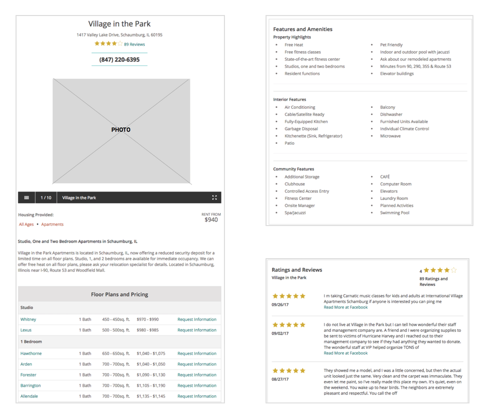
Home page
Users can either do a basic search or enter additional criteria in an expanded advanced search. They will only see listings that meet all their criteria. Further down the home page, users can review blog posts and definitions of the levels of care to identify what their loved ones need and what to look out for as they search. We added continued care because users mentioned how important it was for them to not have to move their loved ones as their need for care increased.


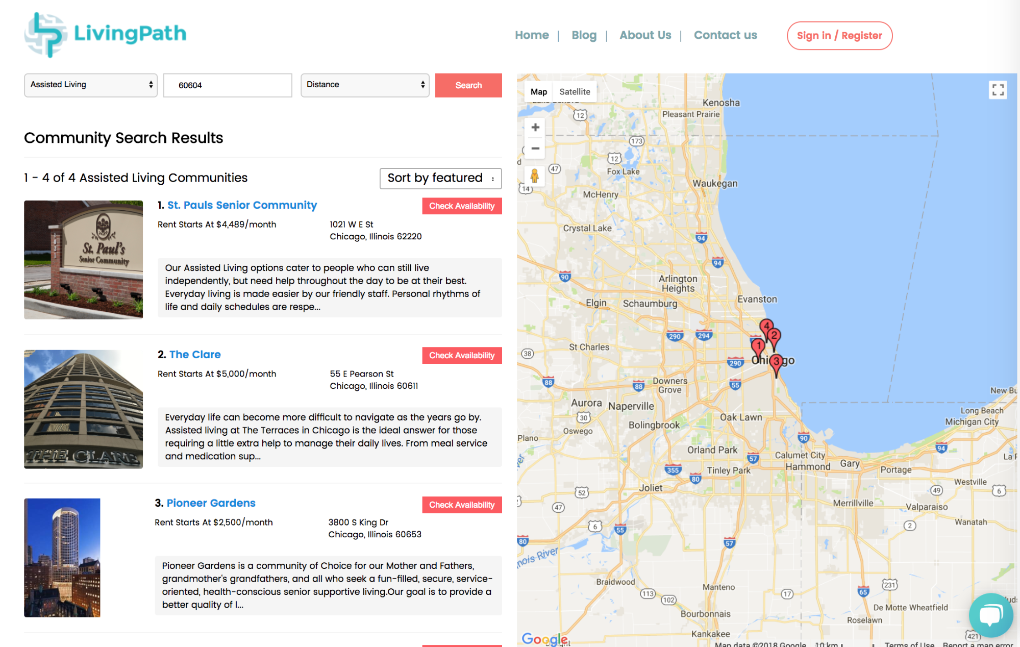
Search results page
Users can adjust their search criteria, favorite listings, and compare up to 3 listings at a time.

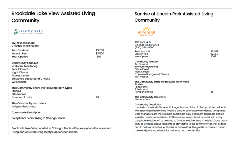
Compare page
Users can view what communities have to offer side-by-side and expand and collapse categories as necessary.

My Favorites page
Users can save communities of interest.

User feedback:
Users liked the layout of the homepage because it looked clean and made it easy for them to digest information.
Users appreciated the additional options of the Advanced Search but it wasn’t immediately obvious to them where to find the options.
My Comparison List and My Favorites features were easy to use and intuitive for users.
Levels of Care, Services, and Amenities were the most important items to users on the comparison chart.
The majority of our users said the information on the comparison chart would be enough for them to schedule visits to communities of interest.
Our design makes it easier for users to narrow their search and compare communities.

Our site map integrating the old and the new.
04. Moving Forward
We recommended:
Continued testing of advanced search placement. In our last round of usability testing, it wasn’t immediately obvious to some users where to look for the expanded search. Testing the current design against others will shed light on where users expect to see the feature.
Community reviews. We found that thorough documentation of services and amenities offered would inspire users to follow up with communities of interest. However, we believe feedback from residents or their families would give users an even better idea of what to expect.
Collecting staff-to-patient ratio, square footage, and floor plan information from communities. During interviews and testing, users shared that when they visit communities some of the first things they’re looking to find out is if they or their loved one will be adequately cared for and can comfortably live in the space provided. Offering this information upfront will help users answer these key questions sooner.
A pre-assessment quiz. When users shared their journey of searching for senior living, many cited a medical complication or general deterioration in their loved one’s health and ability as the impetus for their search. A detailed pre-assessment quiz could clue users into the level of care, services, and amenities they should be looking for based on the information they provide. Consulting with a medical professional when making the questionnaire will help LivingPath establish trust and credibility. We believe this feature would empower users who are unsure of where to start their search or who just want to be sure they’re not missing anything.
Exploring ways to keep "those lists" but hide them as users’ search entries get more specific. When testing the site, users didn’t understand why they were being presented with listings in other cities after they had entered their zip code. They felt this information was unnecessary and visually overwhelming. When we shared this with our clients, they mentioned they had to keep the lists for SEO. If there are opportunities to better manage these conflicting user and business needs, we believe they’re worth exploring.

"Those lists"
Our client was happy to learn the compare and favorite features they had been considering had support from users and were comforted by seeing how the new features fit into their existing site. They saw value in the advanced search survey and were particularly enthusiastic about our recommendation to include a pre-assessment quiz. They believed it would help users get the most from the site and already had a doctor in mind to collaborate with. Our creative director said we did a great job of bringing the client into the story, and appreciated how much we dove into research and thoughtfully synthesized findings. She said we were a treat to work with because we were motivated by feedback and thought about the little things too. Pleased with all we were able to accomplish and how thorough our deliverables were, she invited our client back to work with one of Designation’s UI teams.
05. Final Thoughts
Before LivingPath, I designed a mock fitness app for YMCA members and a job tracking tool for Designation graduates. In both cases, I started with a problem, created a solution after talking to potential users, and through testing and feedback saw it through multiple iterations. This was my first time working with a client on an existing product. The stakes were much higher and I welcomed the challenge. I enjoyed getting current and potential users to talk about themselves in ways that felt natural to them and examining how our product could fit into their stories.
Over the course of this project, I learned to trust my process and adjust it in real time. I saw how important it was to think of personas, journey maps, etc. as tools to help my team empathize with users and bring stakeholders into the conversation, not just as deliverables to be checked off. While discussing the feasibility of new features with clients, I got used to considering the business limitations and priorities of the budding startup and thinking beyond my design team about handoffs to UI and developers.

My design team on the day of our final presentation.