
ChangEd
HOW might we help people PAY OFF their STUDENT LOANS FASTER?

Overview
Timeframe: 3 week-long sprints
Tools: Sketch, InVision, Keynote
Role: User experience (UX) research, content strategy, information architecture, product design
ChangEd is a mobile app that helps people pay off their student loans faster using rounded up change from daily purchases. The Chicago startup gained national attention when they secured funding from ABC's Shark Tank investors. My team of 3 UX designers helped them simplify the dashboard, educate users on the long-term value of their usage, and give users more control over their savings.
“It is rare to work with someone like Tomi. I had the pleasure of working with Tomi during an entire UX project of my companies platform. Throughout the weeks of our project, Tomi was responsive to any questions, thoughtful of my companies vision, and was full of details. Tomi’s positive attitude really made me feel I was in good hands! Thanks Tomi!!”
01. The Challenge
After finding that keeping up with monthly payments didn’t put much of a dent in their student loan balance, Nick and Dan created ChangEd in hopes of empowering people like them to tackle debt head-on. Roundups are saved in a FDIC-insured account and payments are made to a loan company once the balance reaches $100. The app is intended to run in the background, offering a hassle-free way for users to chip away at debt for $1 a month. The app launched in Spring 2017 and had just over 1,000 active users by the time my team of UX designers came on.

The client wanted the dashboard to better emphasize to users the impact of their usage. They also weren’t sure they were showing users what they needed to see first.
Since our client hadn’t done user testing before, cancellation emails served as their main library of user complaints. Inspired by feedback, they were already working on allowing users to link credit cards so ChangEd could be effective for those who primarily use credit for everyday purchases. They gathered from the emails that users were having trouble quickly checking in and understanding their progress through the app. They were also able to identify two types of users — those who felt they weren’t saving fast enough and those who couldn’t always afford to part with their change. They needed to figure out how to accommodate this range of user needs.
My team was asked to:
Discover any weaknesses in the dashboard and find a simpler way to track savings and payments
Better communicate value through the interface
Give members more control over how they save
Figure out how best to display information from multiple accounts and link credit cards
Our client had some idea of how to make the app more usable, helpful, and efficient but they were invested in letting research direct any changes. It was clear to me they wanted to meet users where they were, and I was happy to help them understand exactly where that was. Having just completed my first client project, I was eager to get my hands dirty again and work on a new team.
02. Our Approach
In an effort to familiarize ourselves with the world of student loans and contextualize the challenges users face, we looked to financial reports and articles. We surveyed our competitors for inspiration and to assess their approach to similar goals. We spoke with a loan expert who shed some light on current trends and best practices for handling student debt. We talked to potential users in hopes of understanding their approach to paying off their loans and imagining how ChangEd might best complement their efforts. Finally, we conducted usability testing on the existing app to get users’ first impressions, to learn how they prioritize information, and to see to what extent our proposed solutions matched their mental models
look at the landscape

Student debt has become a national crisis. Loans keep people from reaching other life milestones. Furthermore, interest can drastically increase the total payment amount, muffling the effectiveness of even regular payments. Clearly, Nick and Dan weren’t alone in their frustrations. Our research validated the amount of care and attention they gave this problem and provided us direction when we started conducting interviews.
When scoping the competition, we looked for succinct and easy to skim dashboards that make good use of visual aids. We looked for effective methods of communicating value in onboarding and throughout the app. We paid special attention to copy that educates users on the functionality of the app in a light and digestible manner. We also looked for apps that allow users to tailor their experience according to their needs without overloading them with options.

Acorns does a great job of explaining the basics to users and letting them know what to expect. They put users at ease at by assuring them that their strategy was developed with a Nobel Prize-winning economist and by emphasizing how they’ll use users’ money responsibly.
Qapital stood out to us because it lets users decide how they save and helps them feel empowered. Users can create goals they’d like to save towards and determine rules that dictate how the app distributes money towards those goals.

Talk to users
We interviewed four working professionals who graduated a few years ago and three college students who’ll graduate soon. When we finished the interviews, we created an affinity diagram to make sense of all the data and began to identify patterns.

Some patterns we noticed were: 1) Most of our users have multiple loans, private and federal, with interest rates ranging from 3 to 7%. 2) Their total loan amounts were in the range of 30k to 60k. 3) Nobody had paid off their loans completely. 4) Most people’s parents and school counselors were heavily involved in helping them decide which loans to take out.
Key takeaways
Student loans were mostly out of sight, out of mind for college students.
“At 18 you really don’t know how those things work unless there is a dire need for you to know. I don’t think you realize at 18 what a big financial commitment that is.” — Eva, tax consultant
High-interest rates are a major point of concern for users. To minimize accrued interest, most users planned to pay off loans with the highest interest first, and those who could afford it paid off more than the monthly payments.
“You don’t really feel it right off the bat. You start to notice it more and more over time for sure, and then you look back and you see the interest and you feel like wow, that’s money you could’ve saved.” — Mark, tax consultant
Some users were excited by the prospect of being informed about how much faster they could pay off their loans if they kept using ChangEd.
“Maybe if there was something like a tracker or schedule that said if you kept up at this pace, this is how long it’d take you to pay off your loan, based on your average savings with ChangEd.” — Casey, tax consultant
Some users were unsettled by the amount of time they suspected it would take to reach the $100 threshold and wanted control over the amount and frequency of payments.
“Right now when the money is in “limbo”, I want to be able to set that amount, then it wouldn’t feel like it’s sitting in their pocket when I try to hit that $100. It seems like a lot.” — Mark

Through a card sorting exercise, we learned that progress towards a monetary goal was most important to our users. We also learned that users didn’t want to see bank account information and transactions first on the dashboard.
During our kickoff meeting, our client said their target users were HENRYs, an acronym they came up with that stands for Highly Educated Not Rich Yet. They described them as people, mostly 25 to 30-year-old women, who had a pretty good idea of how their loans were affecting their lives and wanted to pay them off as soon as possible. In user interviews, we heard from two types of users: 1) college students who were still in school and hadn’t thought much about their debt, especially because they didn’t yet have the means to start paying it off, and 2) people who had high-enough paying jobs they were able to pay off more than the monthly loan payments. The latter group closely resembled the HENRYs our clients spoke about so we decided we could make the most of our time on the project by focusing on these main users.

We wrote out the recurring goals, needs, and frustrations of the HENRYs we met with to better visualize design opportunities.
Define the problem
Based on what we heard during user interviews, we were able to hone in on the problem:
Forward-thinking college grads need a flexible and stress-free way to pay off their student loans faster, so they can focus on achieving their long-term life goals without the financial burden of student debt.
Armed with a wealth of research on our users’ habits and frustrations, we felt confident we could find ways to help them pay off debt sooner, have more options to save, and better understand the value of their efforts.
We came up with principles, based on users’ expressed needs, to guide us as we attempted to solve the problem:
Design principles
Inspire confidence through knowledge
Keep users confident in their decision to save extra for student loans by providing transparent information regarding their progress, and by reminding them of the long-term benefits of their everyday actions.
Set it and forget it
Thinking about student loans is stressful; ChangEd should only show users what they need to see, when they need to see it.
Allow for choice
Financial circumstances sometimes change, and a surprise expense or work bonus can make a difference in how users save. Allow users to choose how they contribute according to their current needs.
Lighten up
Student loans are serious business, but our users already know that. Minimize stress by keeping language and tone energetic and clear. Remind them of the light at the end of the tunnel.
03. Initial Exploration
We tested the following concepts with five working professionals to find out if they resonated with users' mental models and offered flexible and stress-free solutions to paying off student debt faster.
Payments and Accounts — Linh’s design
To minimize users’ cognitive load, Linh designed a new landing page that separated activity by accounts instead of aggregating all activity in one feed the way the current app did.

Time Saved Money Saved projections — My design
I made graphs that showed users how much time and money they could save if they put more towards their loan each month in addition to roundups, which would help them pay off their loan faster.
With these projections I wanted to see to what extent predictive analytics could motivate our users. I wondered if they’d be motivated to make extra monthly contributions if they could see estimates of how much time and money they’d save by doing so. Since we learned our users appreciated visual displays of their progress, I thought graphs would resonate better than just showing predictions as numbers. I also kept in mind that our busy millennial needed a low-maintenance tool. A key part of these projections was not requiring users to input their loan information for the tool to work. The app already collected their info and knew how much change the user saved month-to-month. Based on those figures, the app could estimate how much the user could expect to save overall if they were to continue spending as they had been and if they were to contribute extra.

Goal Setting — Lauren’s design
Lauren’s idea was to have ChangEd reach out to users when they had extra money or needed to budget. Users would be given options to adjust their savings and have ChangEd work for them.

04. Our Solution
After a round of testing our low-fidelity concepts with five working professionals, we iterated and refined our designs in Sketch and created a mid-fidelity prototype in InVision. Three new users and two existing users tested our designs on our iPhones to get a real feel for using ChangEd. We presented scenarios and tasks for our users to complete. We wanted to know how intuitive our designs were and how feasible reaching goals were. We also wanted to see how well the solutions we came up with solved the problem at hand.
Payments and Accounts
Since we added more features to the app, we decided that eliminating the tabs and bringing them down as a bottom navigation bar would make it easier for users to explore and find the information they need. Also, we knew the widely-used design pattern would feel familiar to users.

User feedback:
Users liked seeing the progress bar and their ChangEd account info first.
They loved the bottom navigation. They thought it was easier to navigate and more familiar and sophisticated than the tab view in the existing app.

User feedback:
Users preferred to have each account separated out like this over having transactions from multiple accounts listed together.
Time Saved Money Saved projections
During concept testing, users appreciated seeing time and money projections with and without ChangEd because it gave them a sense of the progress they’d made with the app. But some felt there could’ve been more of an emphasis on their current success so I included ‘Without ChangEd’ projections and opted for total payment and total time projections to give users a more holistic view.
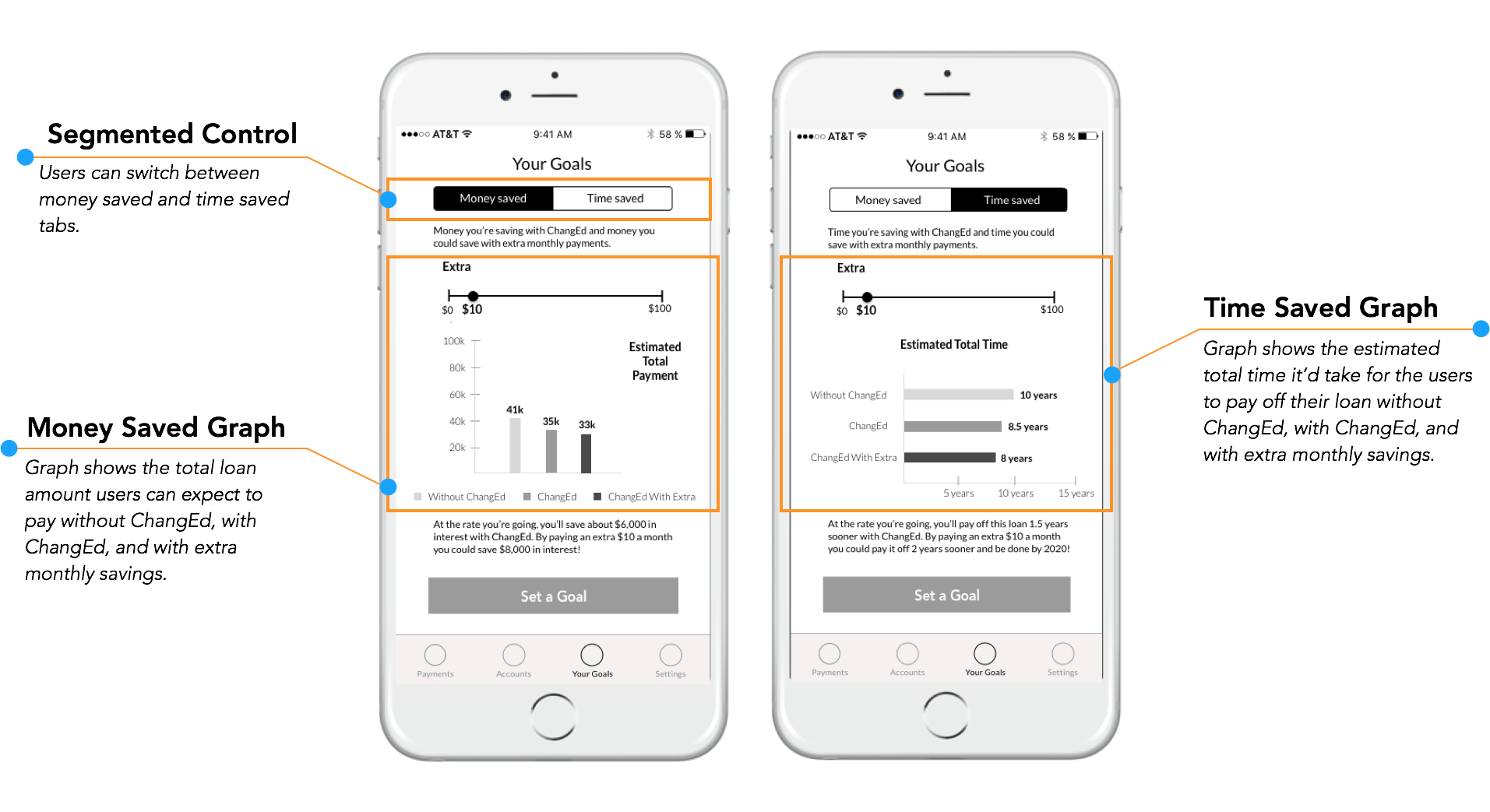
User feedback:
Users said projections served as easy-to-understand and immediate reminders of the app’s value.
Users were enthusiastic about the money saved projection. They enjoyed the slider and were excited to see values of extra savings right away.
Users said the time saved projection was nice to see but they weren’t as moved by it.
Goal Setting
Since we learned during concept testing that projections were a valuable tool for users, we decided to merge them with goal setting so users could see the long-term value of making additional monthly payments in real time. We believed this would better communicate the value of their actions with ChangEd and inspire confidence in their decision to make a greater monthly contribution.

User feedback:
Users liked having options to add extra, budget, and pause, but they saw the latter two options as ones they would hope to use rarely, only in cases of low-balance or emergencies.
Users liked seeing projections here. They found the big numbers easy to read and understand.
Based on feedback from usability testing, we made some final changes and presented our design to our clients, who were quite pleased with it. They felt we went above and beyond what they asked of us and were eager to see the app map, task flows, annotated wireframes, and settings menu we handed off so they could have a better sense of how everything fit together. They felt confident they could start to implement some of our redesigns right away and begin to consider how to support the new projections and goal settings features.

We created an app map so the client could see how our changes fit into the existing app.
Our design has a simplified dashboard, educates users on the long-term value of their usage, and gives users more control over their savings.
05. Moving Forward
Users don’t like surprises. To establish trust and inspire confidence, we recommended:
Making the $1/month fee stand out more in onboarding, having users opt in to full-dollar roundups, and including a clear disclaimer so users know ChangEd will use their bank account info to prompt them to save more.
Users appreciate being contacted at opportune moments. We recommended push notifications and emails that include:
Friendly language to reinforce the Lighten Up design principle.
Graph projections to serve as a visual incentive.
A CTA button encouraging users to take action.
These recommendations will help users feel more informed and empowered when using the app and allow them to take ownership of their accomplishments. They will be more at ease knowing exactly where their money is going and knowing ChangEd could easily accommodate any changes in their financial situation. Moreover, we think these adjustments will help the app reach a balance between giving users options and staying in the background.
06. Final Thoughts
With this project I challenged myself to create graphs that simplified financial information and to understand what information is necessary for projections. I looked to tools online to make up for what I didn’t know about loans coming into the project.
For usability testing, my team had to be scrappy and test someone from our Designation network who matched our user profile. Though it wasn’t ideal, we asked the right questions, especially to understand if and how their viewpoints differed from our target user’s. As a team, we trusted each other to be flexible and accommodate hiccups in our plan.
I got to be more comfortable presenting to clients and, just as I had learned with my previous project, I found meetings were more meaningful when our sprint presentations served as launching pads for great conversation with the client. I learned how to balance showing enough of our design processes and defending our decisions with getting to the point.
I also learned that communicating what I didn’t know was as important as communicating what I did know. Sometimes educated guesses weren’t good enough. I found my process became more efficient when I quickly identified when something didn’t quite make sense and had the courage to ask clarifying questions and move on.

A card sorting exercise with a potential user.