
Fitness
HOW Might we help ymca members Find the right balance & PLan ahead?

Overview
Timeframe: 3 week-long sprints
Tools: Optimal Workshop, Excel, Pencil & Paper, Axure
Role: User experience (UX) research, content strategy, product design
As a design challenge, my team of 4 UX designers was tasked with creating a digital experience that highlights the YMCA’s amenities and offerings in order to increase community attendance. We surveyed over 100 people, interviewed 12 current or potential YMCA members, and met with 2 Subject Matter Experts (SMEs). We attempted to foster inclusivity, transparency, and connection by creating an experience that listens to members’ preferences, highlights what’s most important to them, and encourages them to engage with others on their own terms.
01. The Challenge
Historically, the YMCA has a reputation for being a resource to the community for people who do not have the means or desire to visit a private gym. The original goals of the YMCA were to create a healthy mind, body, and spirit through religion and physical fitness. However, currently the focus seems to be in charitable and humanitarian efforts, with less emphasis on religion, and more on what the social benefits of visiting a community facility are.
The overall goal of this project was to increase attendance at the YMCA by raising awareness of the benefits they provide over other competing facilities. To achieve this goal we had to discover member’s needs, goals, motivations, and frustrations as they related to physical fitness. We sought answers to the following questions:
Who is the primary user/users?
How do users perceive the YMCA?
What are users’ general view of fitness?
How do YMCA members learn about the resources available?
02. Our Approach
To understand what the YMCA was up against, we reviewed the offerings of commercial gyms, online fitness programs, and community-based programs.
Look at the landscape

Competitive analysis
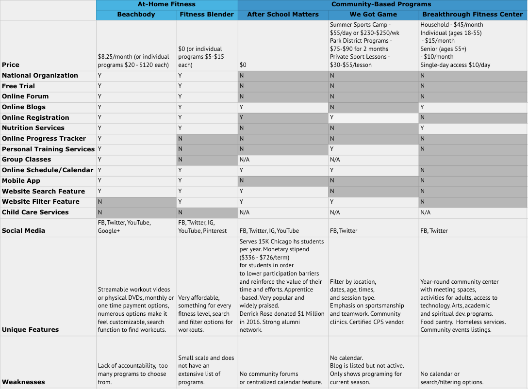
Competitive analysis cont’d
Talk to people
We initially conducted 8 interviews with current and potential YMCA users, met with 2 stakeholders, and received 116 responses to a fitness preferences survey we sent to YMCA users and our personal and professional contacts. During interviews, we did a card sorting activity with participants to better understand their mental models around information in the YMCA app. We wanted to know what information was important to users and how they felt it should be organized.
Key takeaways: sme & user Interviews
“There was an article written a few years ago that said the reason people join a gym you think is because of the equipment that they have, but in reality, it’s because of the relationships they make there.” - Ron, Subject Matter Expert
“It would be nice to have an app that connects you to the gym classes that they offer. Maybe you could be connected to the person leading the class that day. I feel like it would create more of a sense of community within the class.” - Gabriella, YMCA Member
Key takeaways: Fitness preferences survey
Most respondents focused on aerobic/cardio (71.6%) and strength training (62.1%) when they exercise. The Y should consider highlighting their offerings in these key categories.

Survey results
Most respondents (75.9%) found out about fitness resources by researching. This suggested that making information (prices, schedules, resources, etc.) readily available and accessible in one place should be a priority when considering member recruitment, retention, and satisfaction.

Survey results cont’d
Most people preferred exercising at home/outside (63.8%) or at a traditional gym (53.4%). Some preferred personal group classes (38.8%), while others valued personal training (35.3%). Few (19.8%) used apps or videos to exercise. Our team thought this indicated an opportunity to use our digital product to enhance people’s fitness experience. The YMCA could gain new members by providing benefits like progress tracking and support via an online community, features which are currently utilized by fitness apps.

Survey results cont’d
Key takeaways: Card sorting activity
Most participants created groups similar to: About the YMCA, Classes, Services, and Me.
Everyone’s mental model of ‘Instructors’ proved to be different.
Participants nested ‘List of locations’ in various different groups. They had different ideas about where that information should go.
Map out users’ journeys
In our attempts to understand who the main users of the YMCA were, how they perceived and interacted with the YMCA, and how they approached fitness, we defined a primary and secondary persona, and mapped out their journeys.

Primary persona: McKenzie

McKenzie’s journey

Secondary persona: Allen

Allen’s journey
Define the problem
After synthesizing feedback from user interviews and reviewing survey results, we identified what the main issue was and where we needed to focus our efforts:
Members of the YMCA need a way to easily find details about classes and schedule them, so they can add variety to their fitness routine.
Determined to address the pain points we heard from current and potential users, we came up with the following guidelines to keep in mind while thinking of design solutions:
Inclusivity
People with different backgrounds, skill levels, and from all walks of life will feel welcomed to the YMCA family.
Transparency
We will reinforce the trustworthiness of the YMCA by being clear and upfront about information that matters to members.
Connection
We will foster a connection with other members and staff of the YMCA, so that members will feel more supported as they work towards their goals.
03. Initial exploration
Based on all we heard during initial user and SME interviews, we came up with a few solutions aimed at helping members of the YMCA access information about fitness classes and explore different kinds of offerings to keep things interesting. We created low-fidelity wireframes from our sketches and showed them to 5 current and potential YMCA users.

Concept 1

Concept 1 cont’d

Concept 2

Concept 2 cont’d

Concept 3

Concept 3 cont’d

Concept 4

Concept 4 cont’d
During concept and usability testing, we gathered qualitative feedback on our concepts and collected quantitative data regarding the time it took participants to complete tasks, overall satisfaction, likelihood to recommend the app, and critical/non-critical errors.
Key Takeaways:
Participants generally found each prototype easy to use, especially the View, Add, Remove Classes prototype. The Chat prototype was rated the most likely to recommend, suggesting that users favored the feature.
Users preferred to remain on Classes page after confirming “Add Class to Schedule”
Users like the idea of a chat feature
Users want the recommended classes to be be more visible

Quantitative findings
Keeping in mind feedback from both rounds of testing and how users prioritized and organized information during the card sorting activity from the first round of interviews, we took an initial stab at what the information architecture of the app could be.
Since participants had varying ideas about where information about class instructors belonged, we decided to make the instructors’ information accessible from both the home screen and class details screen.
Since participants nested ‘List of locations’ in various groups, we decided to have them choose their home YMCA location during onboarding. We hoped that would minimize confusion and facilitate users getting to the information that’s relevant to them faster.

Information architecture diagram for YMCA app redesign
04. Our Solution
Based on user feedback on our initial concepts, we iterated on our designs and created low-fidelity wireframes of our proposed solutions.

Final YMCA app redesign features

Final YMCA app redesign features cont’d

Our final YMCA app redesign aligned to design principles, which the team developed after learning about the needs and priorities of current and potential YMCA members.
05. Final Thoughts
Prior to this project, I had conducted research in various disciplines before and designed curricula, training materials, and visual aids during the decade I spent volunteering and working in education. This project was my first go at utilizing a formal UX framework and design process. It was affirming to realize that all my experiences interviewing people (as a research assistant) and liaising between business owners and their clients (as a paralegal) were directly translatable to the field of human-centered design. It was humbling to learn to not get attached to designs if they don’t serve the needs of users. Working on a team with people who were also switching careers and who also brought a wealth of different perspectives and skills confirmed my passion for embracing and honoring people’s differences.

My immersive UX design and research program was located in Chicago’s favorite innovation hub, 1871.